Sense2 · Editorial
Inspirations
Brand identity from the world, applied to ours.

discoverearth
Identity by @discoverearth
Colour! We travel to see it, we buy something because we love the colour, we mesmerize the colour of the ocean and the sunset. We all have favourite colours, we choose our colours to dress and love our partners eye colour. USE COLOUR and brand. FIND IT LOVE IT COLOUR IT #sense2lovesbranding #promotionalproductsaustralia #brandedmerchaustralia #corporategiftsaustralia #australianbrandidentity #brandcrushoftheweek #stopandbrand #storiesmakebrands
ses.tudio
Notice the heavy drape of that knitted textile spilling out of a rigid black frame. The quiet, generously spaced serif wordmark anchors the composition, letting the vibrant zig-zag pattern do the actual shouting.
natgeo
Feel and brand.emotions and colours engage instantly. We cant stop looking. #sense2lovesbranding #promotionalproductsaustralia #brandedmerchaustralia #corporategiftsaustralia #australianbrandidentity #brandcrushoftheweek #stopandbrand #storiesmakebrands
thecoolhunter_
Look at the high-contrast silhouette cast against the stark white stucco. Instead of dropping a vector logo into the corner of the frame, they have integrated their brand mascot into the physical environment as a literal shadow, rewarding the eye that lingers.
northlandscapes
Stop and brand. A wordmark like northlandscapes's — soft serifs, generous spacing, one quiet colour — does the heavy lifting before a single customer walks in. Identity by @northlandscapes. We've been thinking about it since. #sense2lovesbranding #promotionalproductsaustralia #brandedmerchaustralia #corporategiftsaustralia #australianbrandidentity #brandcrushoftheweek #stopandbrand #storiesmakebrands
aesop
The surface tension of water droplets clinging to the ribbed black cap and brushed metallic tube forces a visual bridge to the organic leaf above it. Generous negative space around that fine-serif wordmark lets the raw material and moisture do all the talking.
ring_automotive
More than just a badge. Did you know… The @porsche logo first appeared in 1952 on the steering wheel of the Porsche 356, on hubcaps from 1959 and on all Porsche bonnets from 1965. Max Hoffman – an Austrian-born US car importer played a crucial role in the idea of creating a Porsche logo. At a meeting with Ferry Porsche in New York in 1951, Hoffman urged Porsche to develop a symbol that reflected the company’s roots, quality and dynamism of his products. The design that followed has stood the test of time, although it has gone through several revisions over the decades, the fundamental elements have remained the same. • The ‘crest’ draws inspiration from Stuttgart’s city seal, which features a rearing horse. Since Stuttgart itself was founded around 950AD as a centre of horse-breeding and stud farms. The stylised antlers were also taken from the region’s coat of arms. While the horse represents strength, the red and black stripes on either side are reflective of the traditional crest colours of Württemberg-Hohenzollern. 📷 Photos were taken during the Yorkshire Porsche Festival at 🇬🇧 Lotherton Hall. If you’re very observant, you may notice a few non-standard badges too! #porsche #porsche911 #porsche912 #porsche356
adidasgolf
Thick white stitching bounds the blue fill, sitting proud off a heavy navy weave. They have not just applied a logo; they have built a tiny, tactile sculpture on the fabric that catches the light and casts its own shadow.
zita.fernandez
Circular debossing on a brushed metallic cap forces physical interaction. Sinking the typography into the metal rather than printing on top signals permanence, while the curved layout means the user has to roll the object in their fingers to read it fully.
branding.board
Branding for @barnesnaturals, an Australian wellness brand known for its premium Manuka honey products. by @ashbrennan Submit your work for a chance to be featured #brandingboard
 ⊟ 10Brand crush@thomasfotomas
thomasfotomas
Look at how the aggressive horizontal motion blur flattens the ocean into soft bands of pastel, forcing the sharp silhouette and that high-vis yellow board to command the frame. The contrast between the washed-out background and the crisp, highly saturated focal point does all the heavy lifting for the eye.
 ⊟ 7Brand crush@thebrandingboutique.la
thebrandingboutique.la
The heavy film grain and generous tracking on that soft serif typography anchor the middle of a vast, dark negative space. They let the sheer emptiness of the landscape create tension, making the ship feel like a discovery rather than a billboard.
 Brand crush@celine
celine
The heavy film grain and soft focus on that deep blue gradient pull you straight into a mood before you even register a brand. It proves that low contrast and raw texture can hold attention far better than a sharp, glossy image.
stamprintslife
The sharp ridges of this blind emboss catch the ambient light, turning a standard matte silver pouch into a textural study. By dropping ink entirely and letting a mechanical press alter the surface, the wordmark relies purely on shadow to be seen.
harena.studio
The contrast between the smooth glass threads of the jar and the jagged, fracturing ice block completely changes how you perceive the packaging. Freezing the product mid-splash forces the eye to stop and study the silhouette rather than just reading a label.
 ⊟ 13Brand crush@versedvisual
versedvisual
The texture of the raw linen completely grounds those tiny metallic beads, creating typography that catches the light and casts a physical shadow. By rendering the wordmark as a 3D, tactile object rather than a flat print, the branding demands a second look.
hellowearenature
That deep blind deboss in the top right corner forces the material to do the talking before you even register the central illustration. The heavy terracotta grain absorbs the light, making the fine linework feel anchored rather than just printed on top.
sarv.vj
The deep shadows pooling in those circular impressions do all the work here. By relying entirely on a blind deboss against a heavy, granular metallic texture, the mark feels permanent and tactile rather than just printed on top.
best_birds_shots
The density of those thousands of dark, individual specks against the diffused grey-blue sky creates a macro silhouette without a single hard border. They built a massive, readable shape entirely out of dynamic clustering and negative space rather than solid ink.
davidattenborough_fandom
The hyper-saturated cyan against the massive, soft-focus taupe background forces your eye to rest in exactly one spot. It proves that when you give a single, vibrant asset enough empty space to breathe, you don't need complicated graphics to hold attention.
northlandscapes
Look at the deep, undulating shadows across that slate surface. The visual weight here comes entirely from the physical texture, letting the actual branding step back into a single, quiet tone with generous kerning.
auspicious_art1
The way those raw, translucent strokes catch the sunlight against the blue sky creates a sense of weightless texture. Pairing a high-impact, tactile visual with a quiet, generously spaced serif wordmark means the brand feels both grounded and entirely unrestricted.
overtheseadress
Look at the density of the floral texture and the way those tall blue stems break up the warm peach tones. Using an unstructured, full-bleed botanical photograph as a brand asset does the heavy lifting before a logo even enters the frame.
 ⊟ 10Brand crush@welovebranding
welovebranding
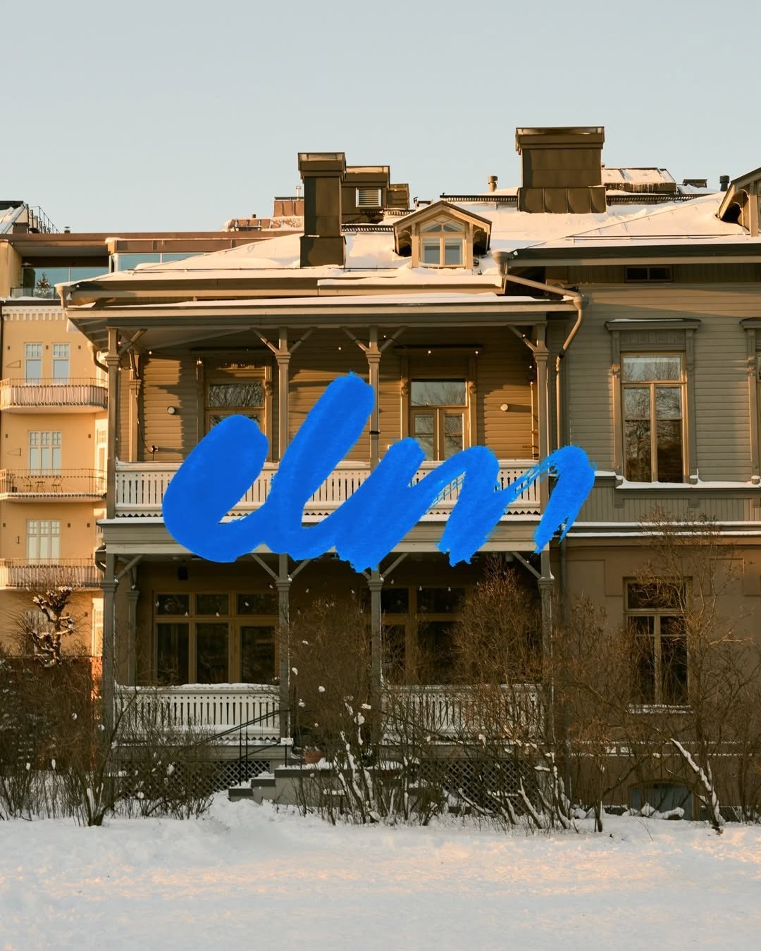
That thick, wet-brush cobalt blue heavily layered over the muted, snow-dusted timber facade creates immediate friction. The sheer scale and texture of the mark acts as a physical intervention, completely disregarding the architectural grid behind it.
infinite_mantra
Look at how the dense indigo pigment pools and holds at the outer edge, contrasting against the matte peach paper. The tension here lives between those highly structured, radiating fine lines in the centre and the completely organic, unpredictable ink bleed on the perimeter.
 ⊟ 17Brand crush@jackofbrands
jackofbrands
Look closely at the precise Pantone match between the canvas awning, the heavy wool coat, and the paper carrier bag in motion. Owning a single, deeply saturated colour across totally different material textures builds more brand weight than plastering a logo on everything in sight.
 Brand crush@graphicdesignersgroup
graphicdesignersgroup
The crisp white border of the Pantone card casts a subtle drop shadow against a flooded red surface, anchoring the organic mess of strawberry seeds and water droplets. They tied their exact brand red to a visceral, physical object, turning a clinical colour code into a sensory cue.
 ⊟ 5Brand crush@uncocostudio
uncocostudio
Stop and brand. A wordmark like uncocostudio's — soft serifs, generous spacing, one quiet colour — does the heavy lifting before a single customer walks in. Identity by @uncocostudio. We've been thinking about it since. #sense2lovesbranding #promotionalproductsaustralia #brandedmerchaustralia #corporategiftsaustralia #australianbrandidentity #brandcrushoftheweek #stopandbrand #storiesmakebrands
 ⊟ 7Brand crush@welovebranding
welovebranding
The motion blur on the basket and trees grounds this image in a fleeting moment, while the generously tracked serif typography stays perfectly sharp. Setting quiet, spacious text against an active background creates a tension that makes you stop scrolling.
gonnnnzzzzalo
Notice the deep shadows cutting across the sunlit crests of the grass. Relying on organic texture and natural light rather than heavy ink floods gives a surface an inherent, quiet weight.
organik_festival
Look at the focal blur on the moss and how the crisp, micro-spaced text sits over it to build a silhouette. Using the wordmark as a pointillist texture rather than a standard logo stamp allows the branding to fuse entirely with the physical environment.
loewe_perfumes
The extreme macro shot of the iris and skin texture creates an intimate, almost intrusive backdrop. Dropping a sharp, flat yellow serif right over that organic warmth lets the typography do the heavy lifting without showing a single product.
 ⊟ 5Brand crush@uncocostudio
@uncocostudio
Stripping away the packaging to lay a quiet, generously tracked wordmark directly over a hyper-textured macro shot is a deliberate trust play. It signals absolute confidence in the raw material, forcing the viewer's brain to process the sensory weight of the product before it even registers the brand name.
@br.and.ing
Effortless. Wearable. Quietly confident. 🤍✨ @casafern_ is a clothing brand built around elevated everyday wear — pieces designed for daily life without excess. @temple.haus built a visual identity with the same philosophy. A monogram where C and F are abstracted into a unified symbol structured and fluid, soft and strong, held together in quiet harmony. A mark as considered as the clothes it represents. ✨ Brand Identity & Logo Design: @temple.haus for @casafern_ #BrandIdentity #GraphicDesign #VisualIdentity #LogoDesign #FashionBranding
@celine
Establishing market authority often means knowing what to leave out. Committing to a singular, immersive macro-texture while reducing the logo to a quietly spaced wordmark builds premium positioning before the audience processes a single rational claim.
@celine
Embedding a sharply milled gold monogram among vintage bone and resin dice signals effortless ownership of the leisure space. The strategic bet here is that a quiet, tactile intervention builds stronger brand recall than a high-contrast logo slap ever could.
@change.branding
Inspired by the natural environment where the Cosmos flower grows, the identity was built through carefully selected elements symbolizing love, beauty, calmness, and warmth, from birds and flowers to soft organic details that create a peaceful visual experience. Known as the chocolate flower, Cosmos was designed as a premium chocolate brand offering floral-shaped chocolates and marshmallows through an elegant and emotionally rich visual world. The result is a refined identity that blends nature, sophistication, and emotion into a memorable brand experience.
 ⊟ 9Brand crush@jdomito_
@jdomito_
We created an identity that feels structured, editorial, and quietly authoritative. Accessible enough to guide, but solid enough to lead. Inspired by institutional systems and publishing, the visual language leans on typography, grids, and restraint. The brand behaves like a framework, not decoration. If your brand feels fragmented, it’s time to organize it. → Apply through the link in bio.
@ten.10.design
[ Naming + Branding Project ] NOLI — CDMX (Mexico) Logo / Identidad / Colores / Tipografías / Texturas / Patterns Prossimamente en Chicago 113, Esq Av. del Parque, Nápoles📍
@clackestudio
Treating a dense, chaotic forest like standard wrapping paper is a quiet flex. They dropped a polite, widely tracked wordmark right over all that organic noise, letting the extreme contrast do all the heavy lifting.
 ⊟ 4Brand crush@monpalette_
@monpalette_
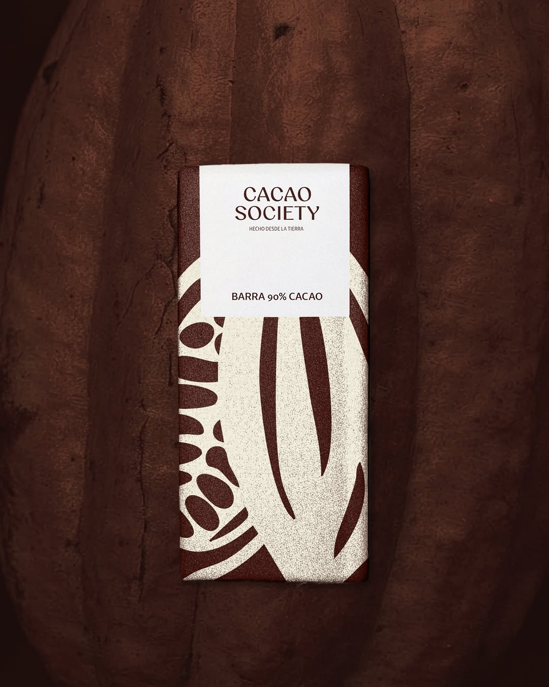
💚 Todas las aplicaciones de Cacao Society las diseñamos para que se sintieran más que una marca artesanal “de mercado”. Nuestra clienta nos pidió darle un estilo moderno y fácil de recordar 💭 🤸🏽 Si estas por abrir tu negocio, crea tu imagen con nosotras solo agenda tu sesión de informes gratos en el link de nuestra bio ☕️ . . . . . . #branding #logo #diseñadoras #identidadvisual
@ten.10.design
Single-colour flexo print on a bleached kraft stock proves you do not need a four-colour process to hold attention. They have used the sheer scale of the vertical block typography to turn a standard takeaway vessel into a walking billboard, while the matte terracotta ink grounds it in a tactile warmth.
olliecatton_designs
Look at how the 'c' and 'a' physically merge in this frame to carve out a hidden shape in the negative space. It is a clever typographic trap that forces the eye to stop and solve the puzzle, making a static olive-on-chartreuse wordmark feel highly intentional.
lottanieminen
They have let the typography and the texture do all the heavy lifting. The soft serif wordmark and the tonal monogram on a textured canvas-like stock communicate restraint without needing metallic foil or loud contrast.
superhmns
The visual tension here comes from marrying a rigid, repeating optical grid with unapologetic, high-contrast typography. It proves that you do not need complex graphics when your palette and spacing command the room.
superhmns
The design uses a horizontal distortion effect to imply kinetic energy, pairing sharp, outlined typography with a blurred background. It forces a static image to feel like it has a pulse.
Bedrock
They have taken a rugged, utilitarian object and applied quiet, editorial typography to it. The heavy lifting is done by the contrast between the industrial hardware and the soft, tone-on-tone serif webbing.
You
The power here is stark contrast and negative space. Dropping a crisp, uncrowded logo onto a flood of solid, vibrant color creates an instant visual anchor without relying on complex graphics.
Want something like these?
Ask Findie for a quick conversation, or hand the brief to Susan and the team. Either works.